Quikswitch
Branding, Print Design, Web Design
Creating a brand identity and website for a new energy comparison service based in Nottingham, UK.
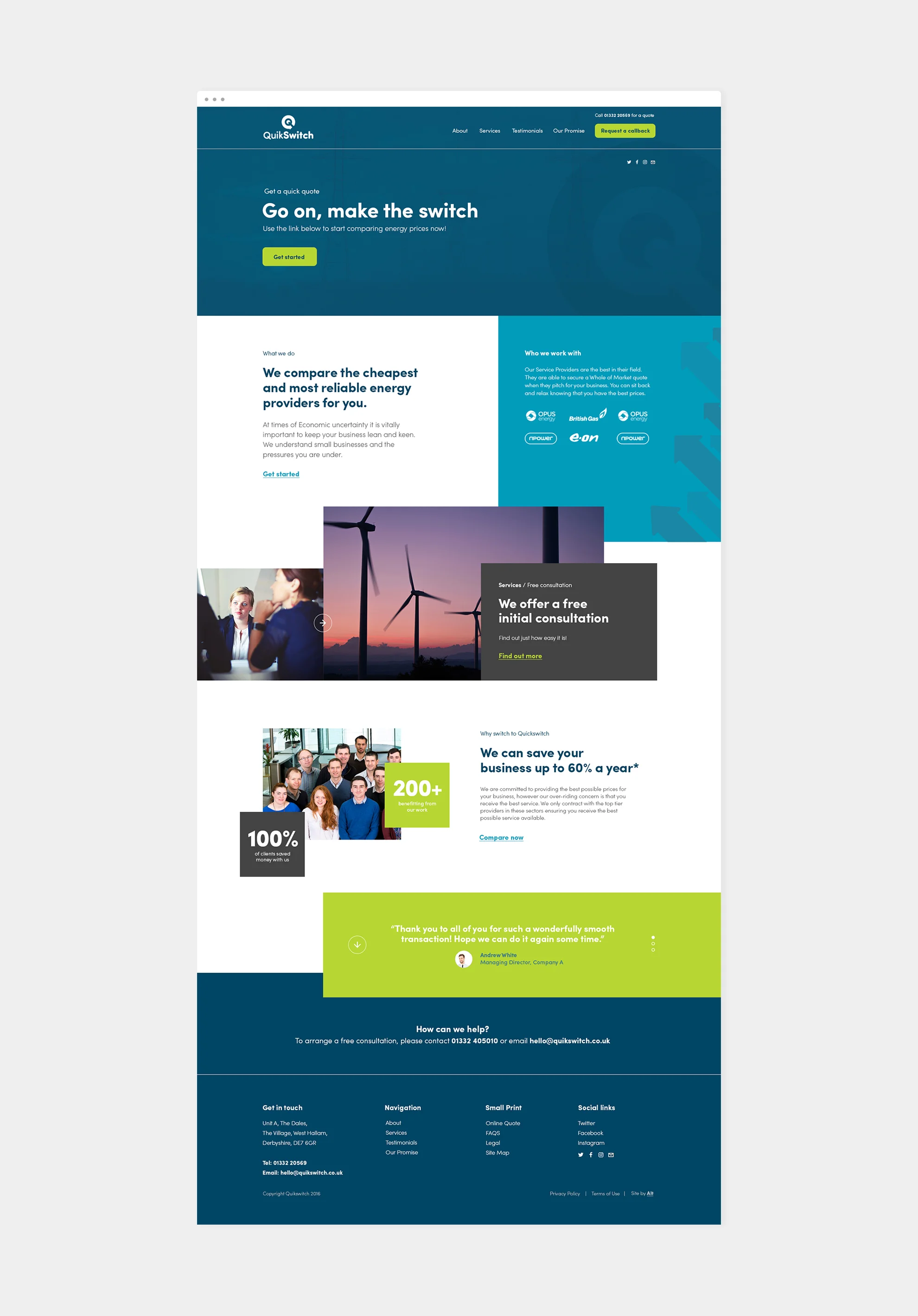
Quikswitch, unlike most energy comparison companies, offer a service that is based heavily on building and maintaining great client relationships, mentoring them whenever they need assistance or financial advice. The service they offer is also quick and user friendly.
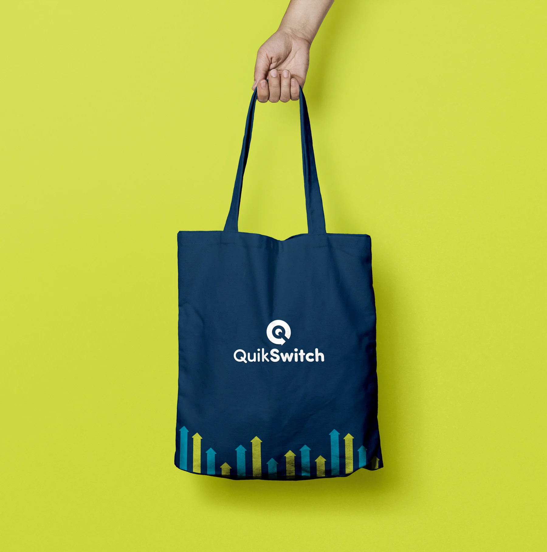
It was for this reason that I felt it was important to position their brand as friendly and approachable, with a chatty tone of voice and a vibrant palette - all the while maintaining a modern and professional look.
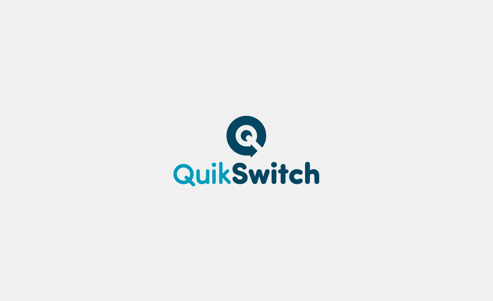
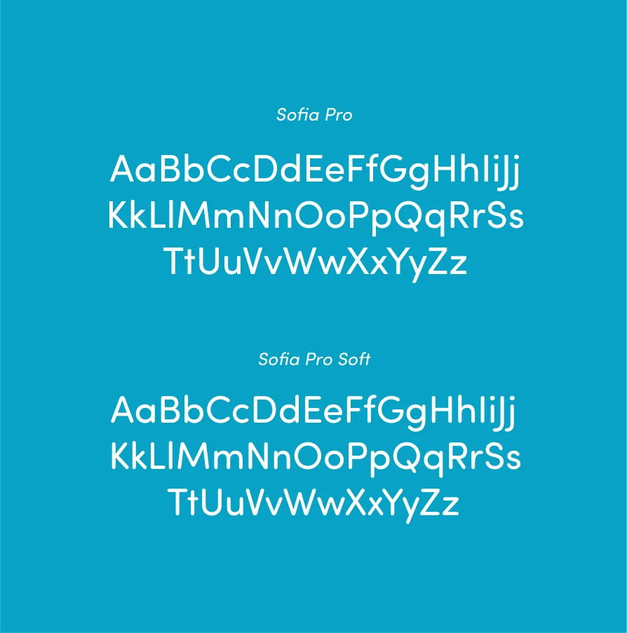
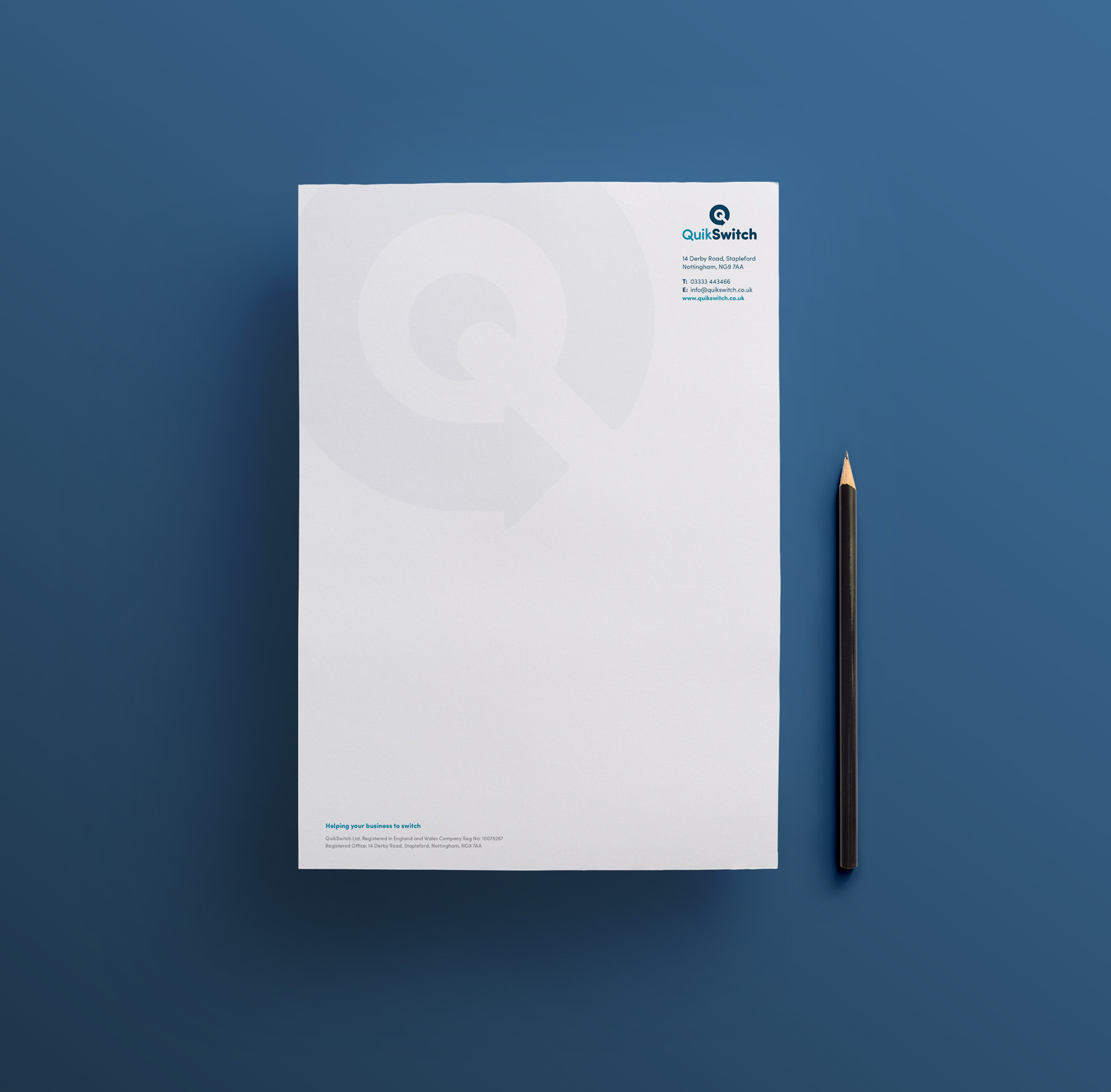
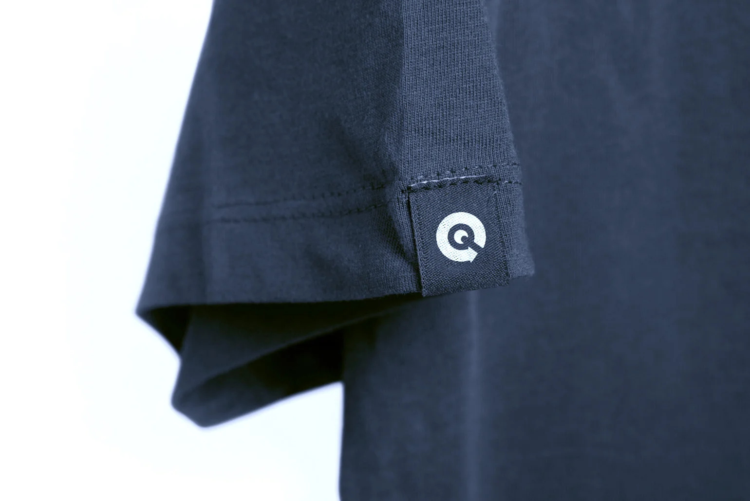
The chosen logo concept encompasses a letter Q inside the negative space of an arrow - symbolising both the speed and reliability of the Quikswitch service. A soft, rounded, Sans Serif font was used to maintain the friendly and approachable tone of voice.
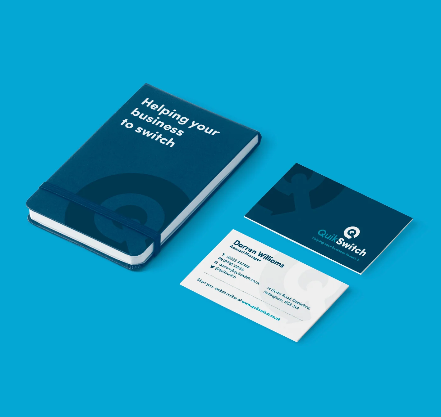
As the brand took shape, various print materials were produced, including letterheads, business cards and corporate brochures.
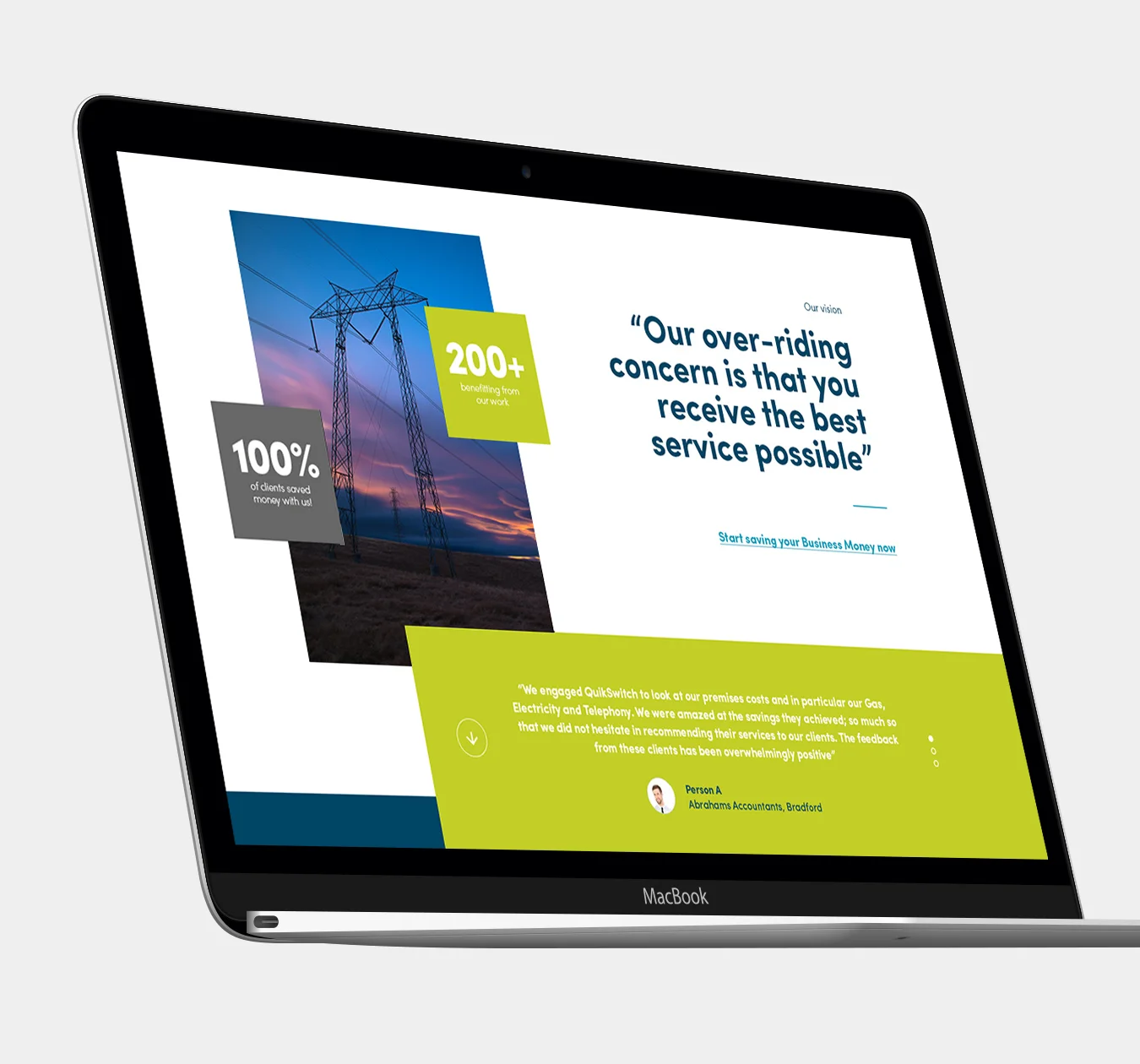
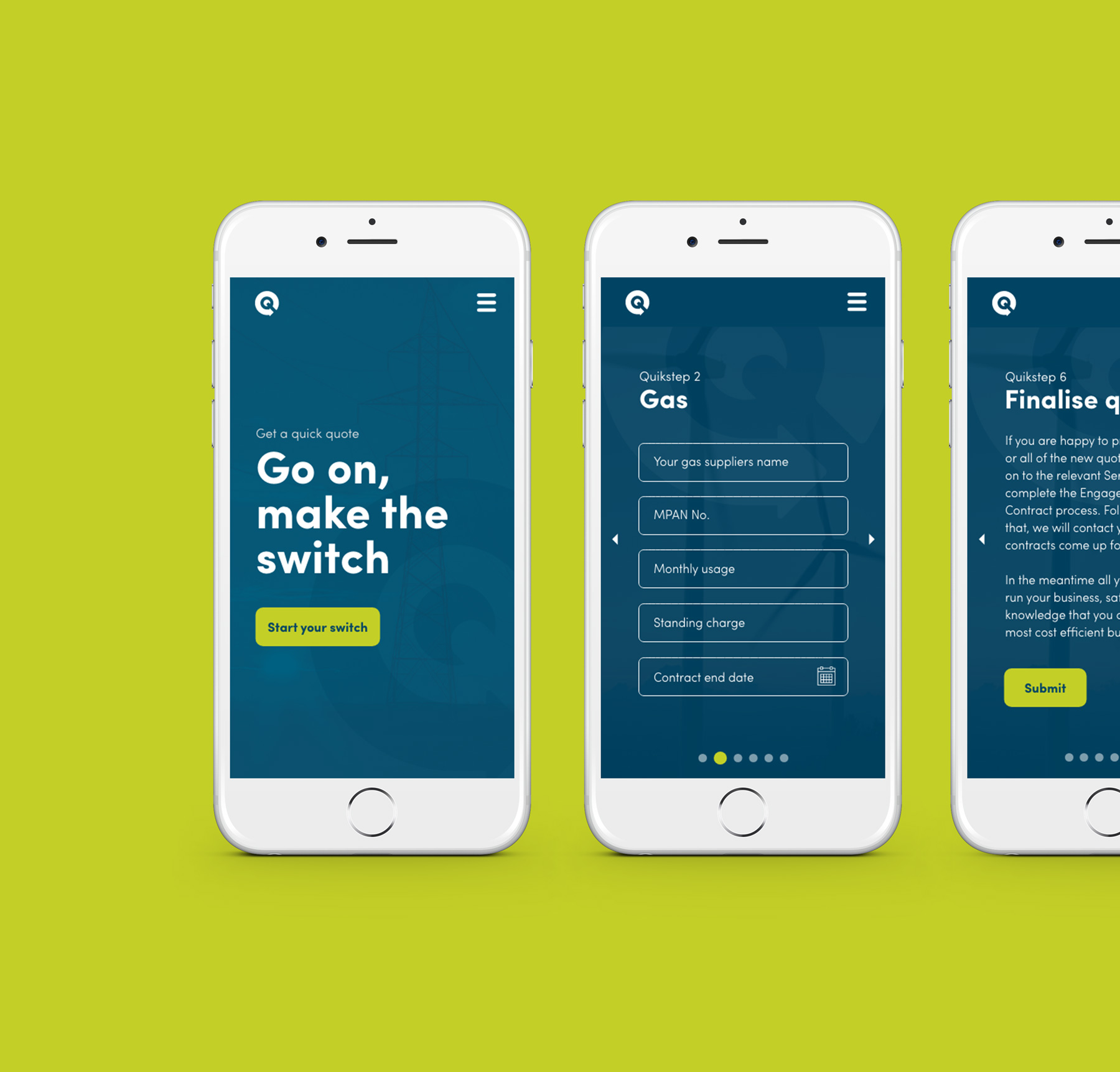
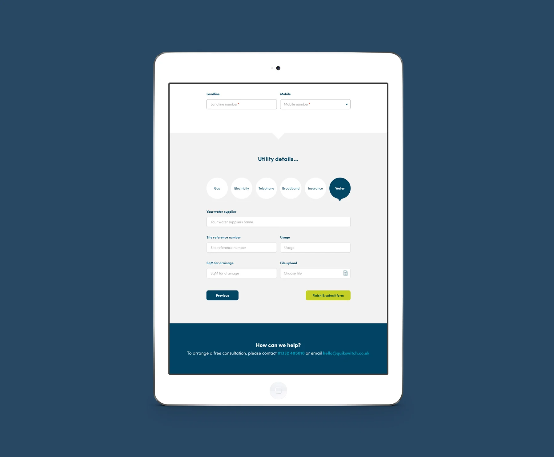
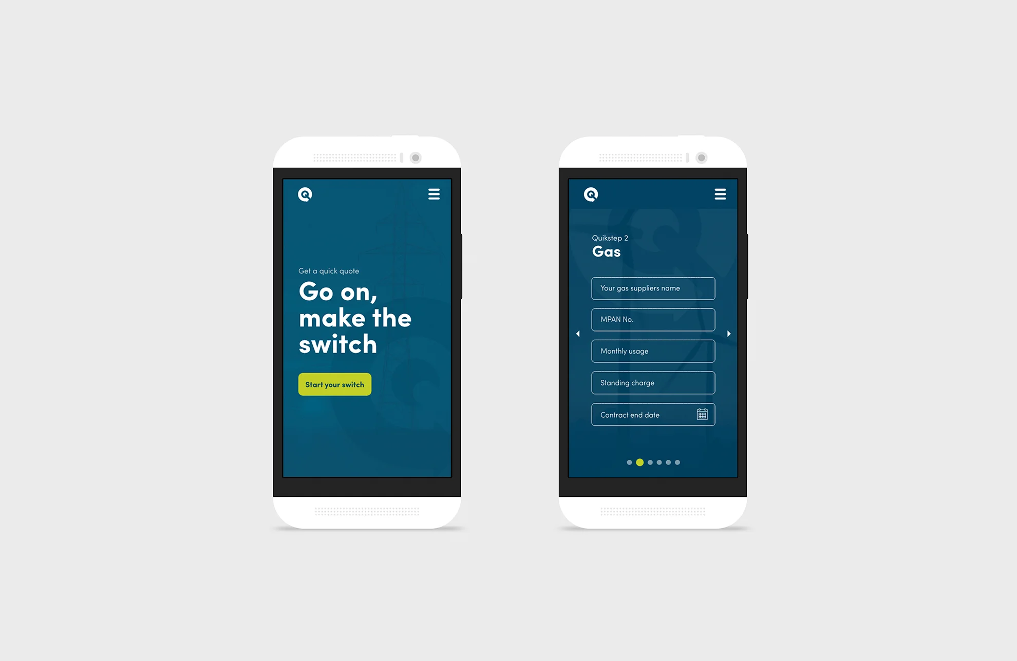
I was also responsible for designing their new website, giving users the ability to apply for quotes in a quick and efficient way. The site created takes advantage of parallax scrolling, allowing elements to move at varying speeds, and is also fully responsive.
Quikswitch are a client that I worked with for over a year whilst at Alt Design.