Planet-U
Branding, Web design
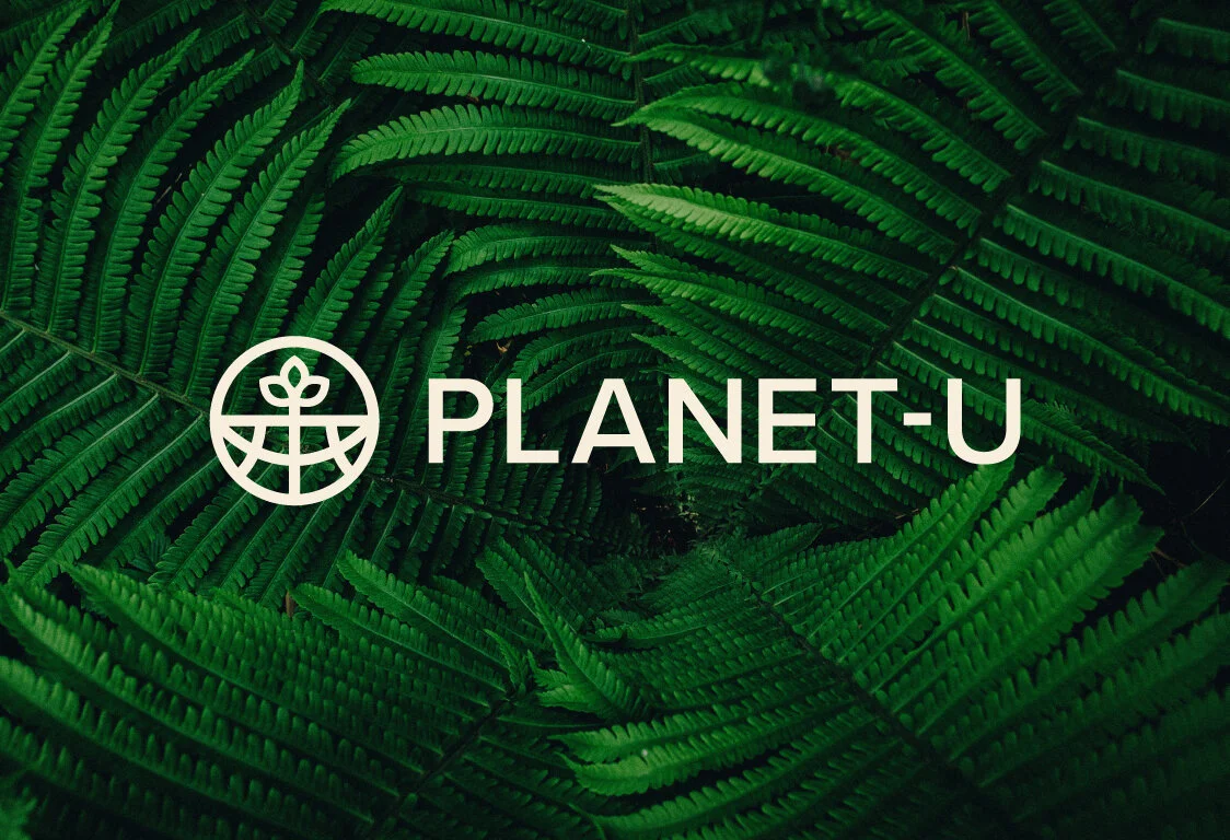
Re-branding Planet-U: a renewable energy specialist based in Leeds.
Planet-U wanted help refreshing the look of their brand to sit closer in-line with their vision, values and purposes.
Their previous brand identity was corporate, old-fashioned and visually sat closer to what is to be expected of a tech company than a leading renewable energy company.
I designed a new look and feel for them that better reflected their vision. This included a logo that illustrated the brand at it’s core, a more ‘natural’ palette, tapping into the ‘power’ of nature and considering sustainable materials. After all, they are a team that believe in a sustainable future - so it’s only fitting this should be reflected in their brand.
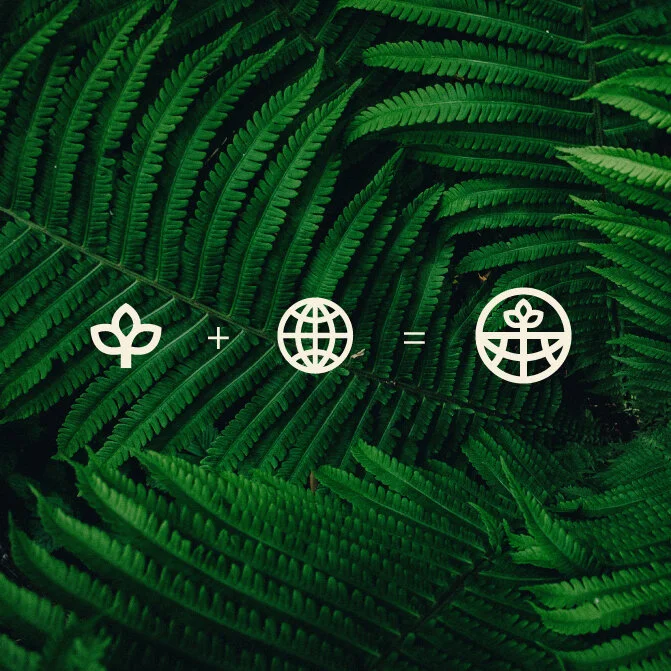

A symmetrical brand mark, comprised of a globe shape and a growing plant, illustrates Planet-U’s commitment to renewable energy and care for the planet.
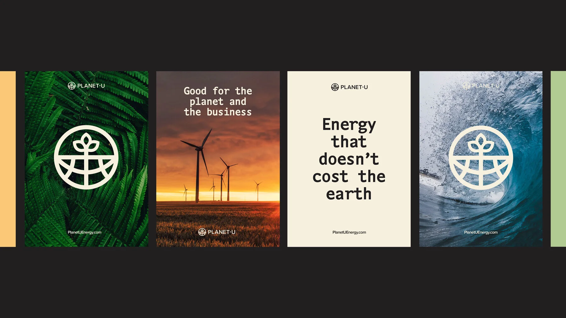
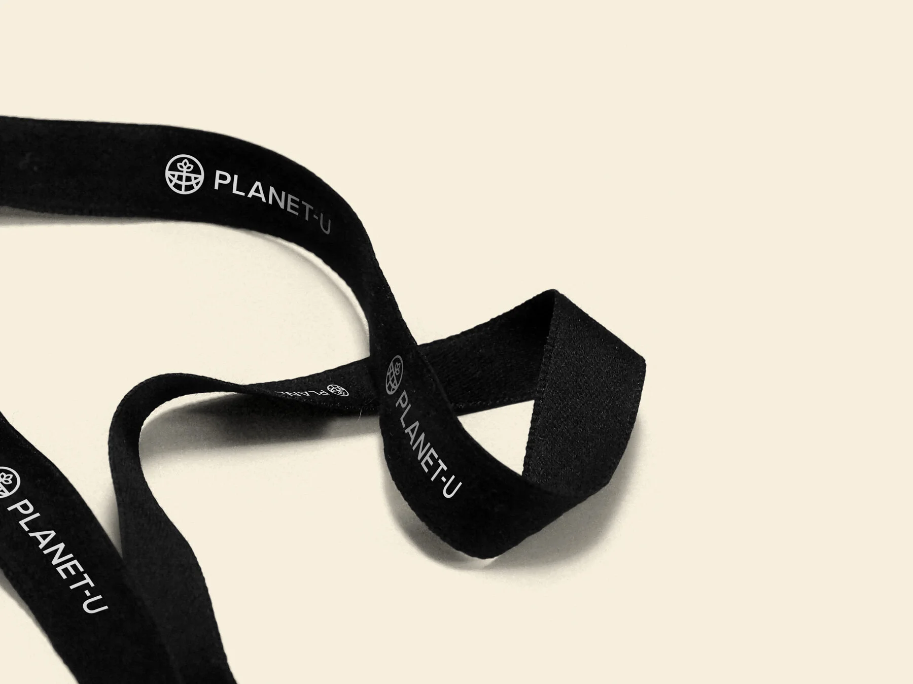
A monospace font was chosen to replicate typewriter lettering - rooted in the physical, rather than the digital space. Close up photography showcases the raw ‘power’ of nature, co-existing with sweeping landscape shots that showcase the energy being harnessed in the natural environment.
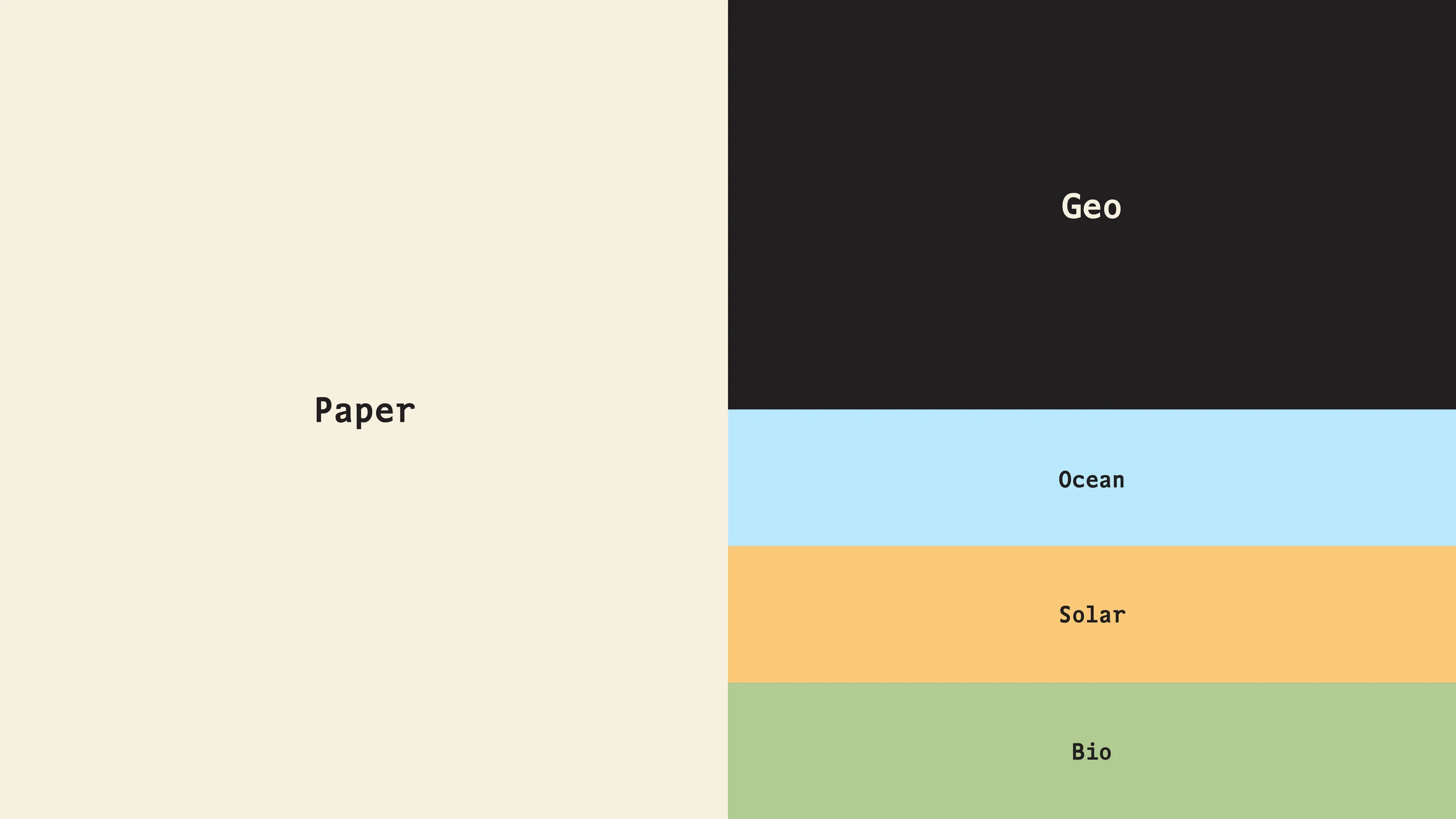
The colour palette draws direct inspiration from renewable energy sources and materials.
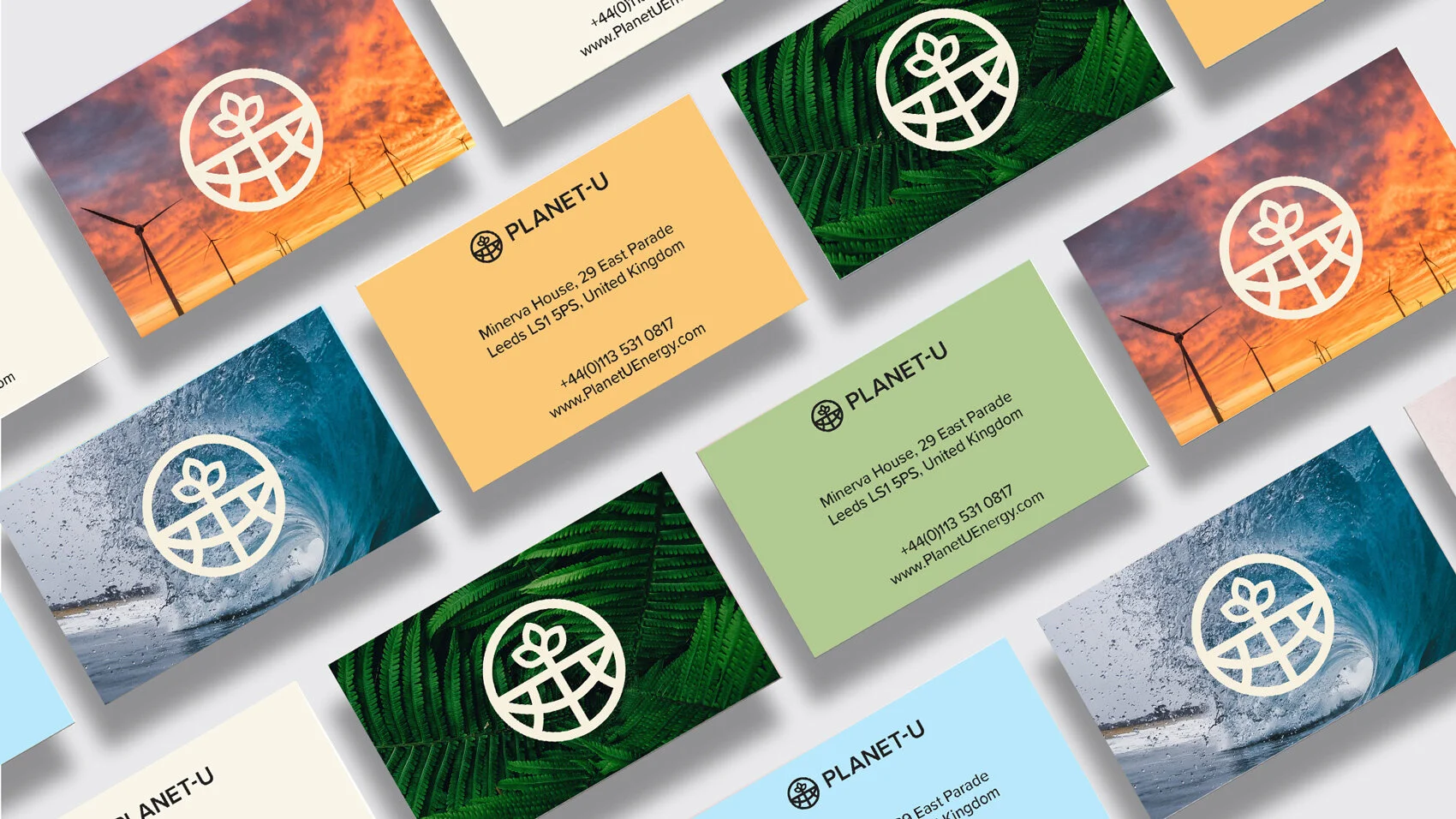
Business card variants.
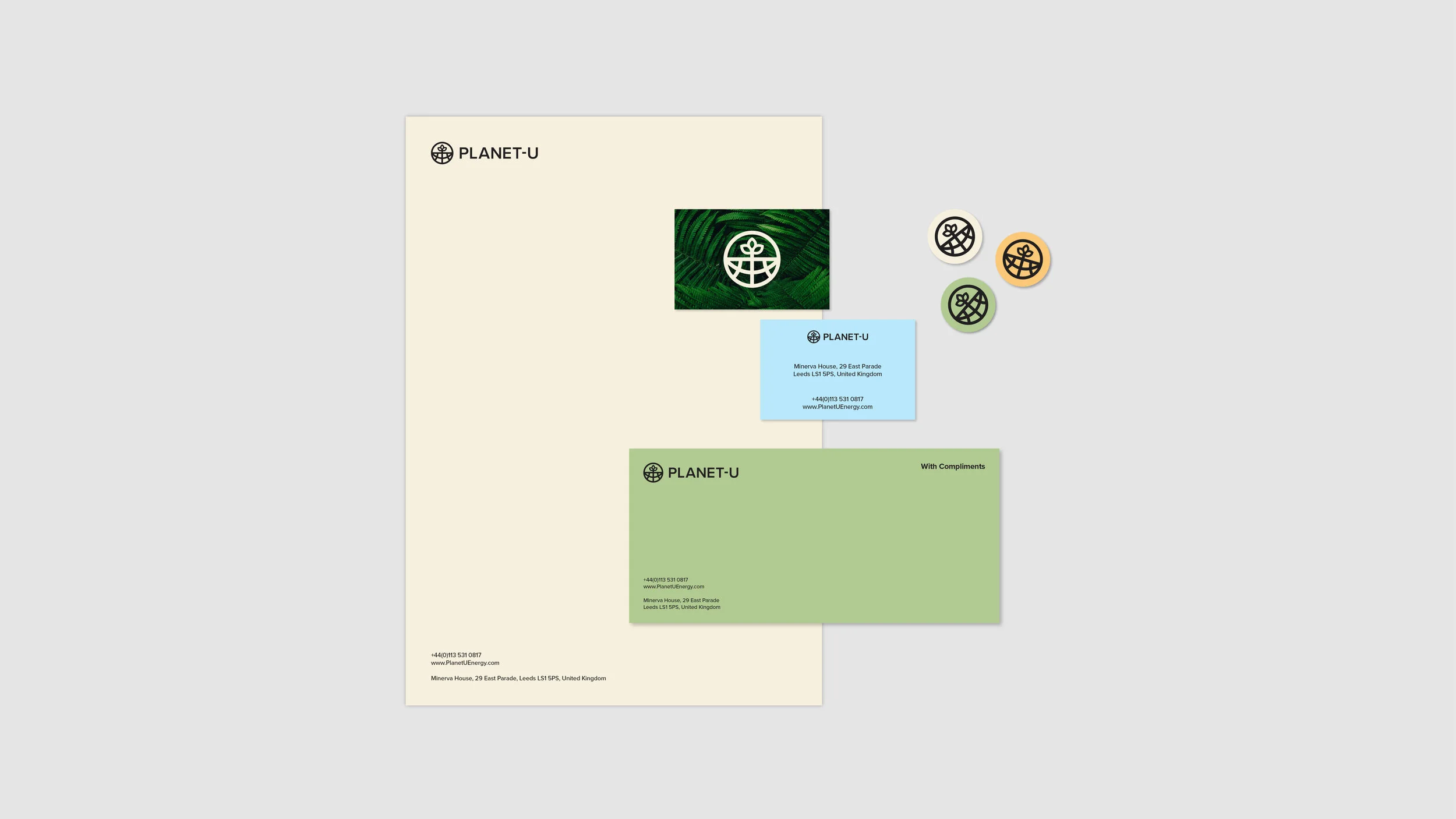
Stationery suite.
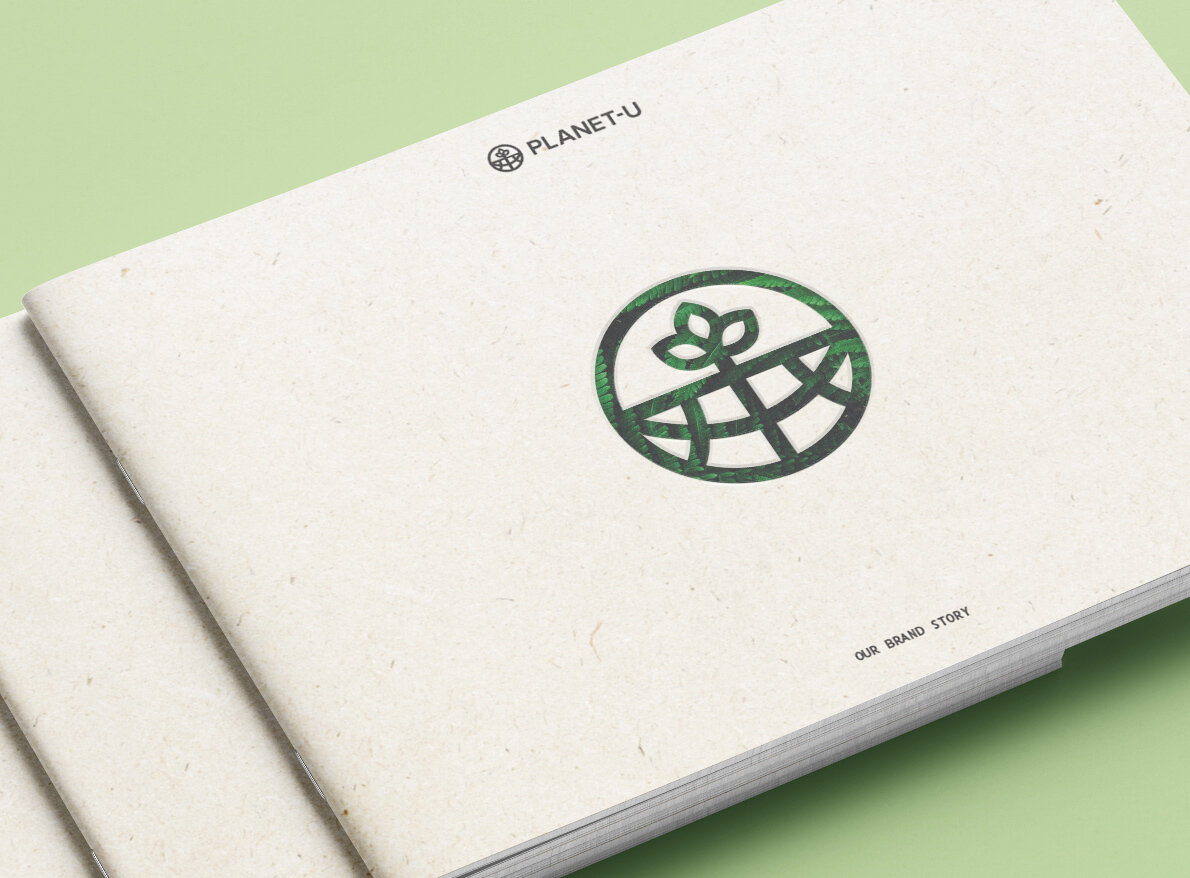
Brand book front cover - made from recycled paper stock.
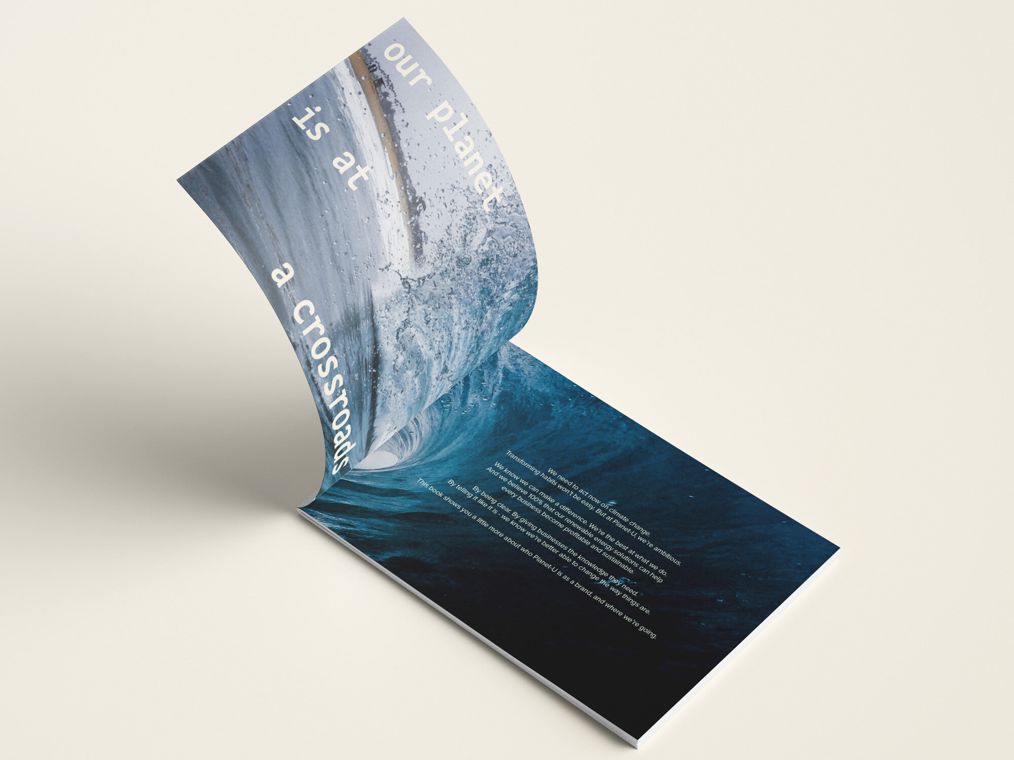
Inside the brand book - manifesto spread.
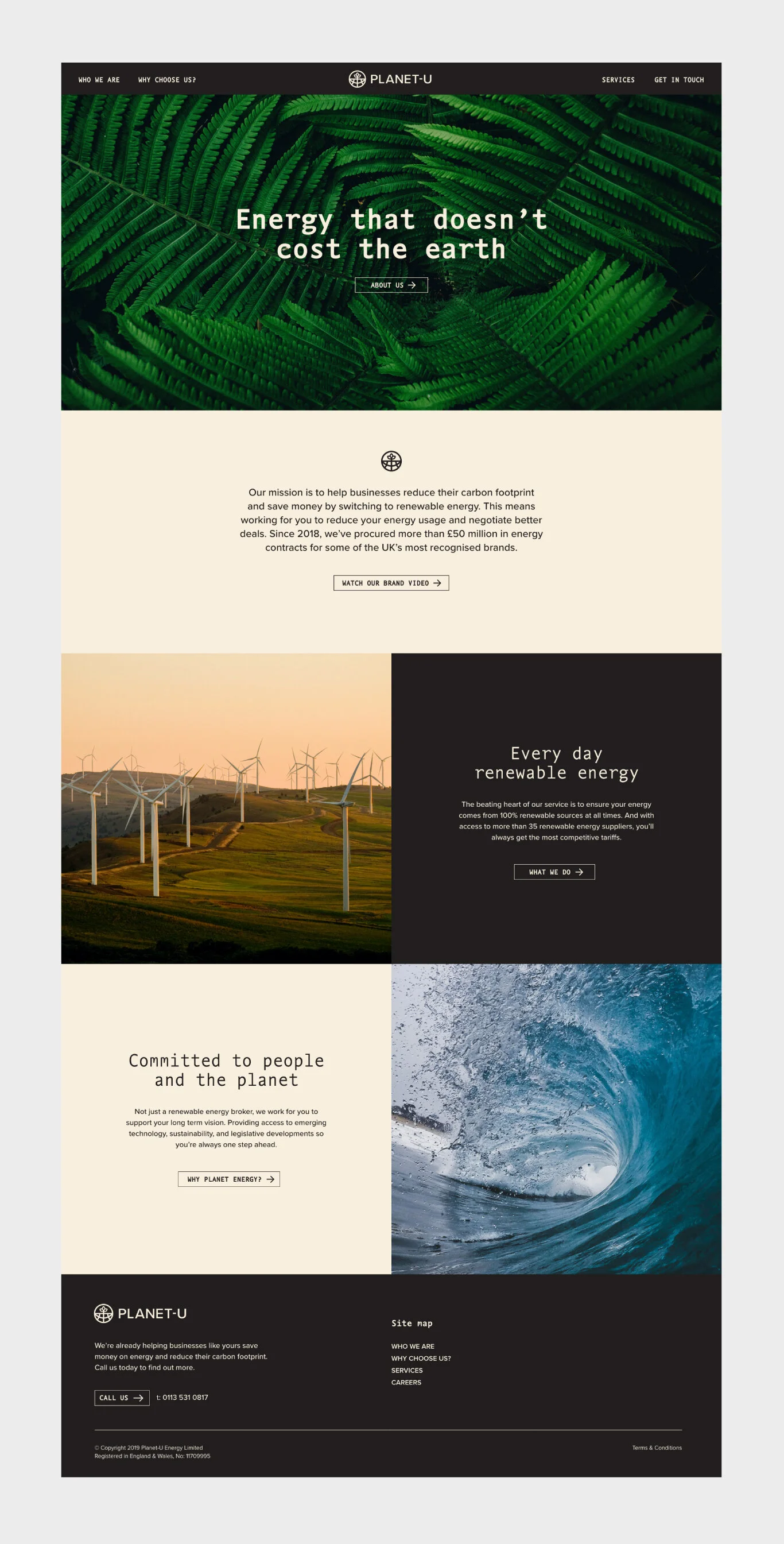
Website design.