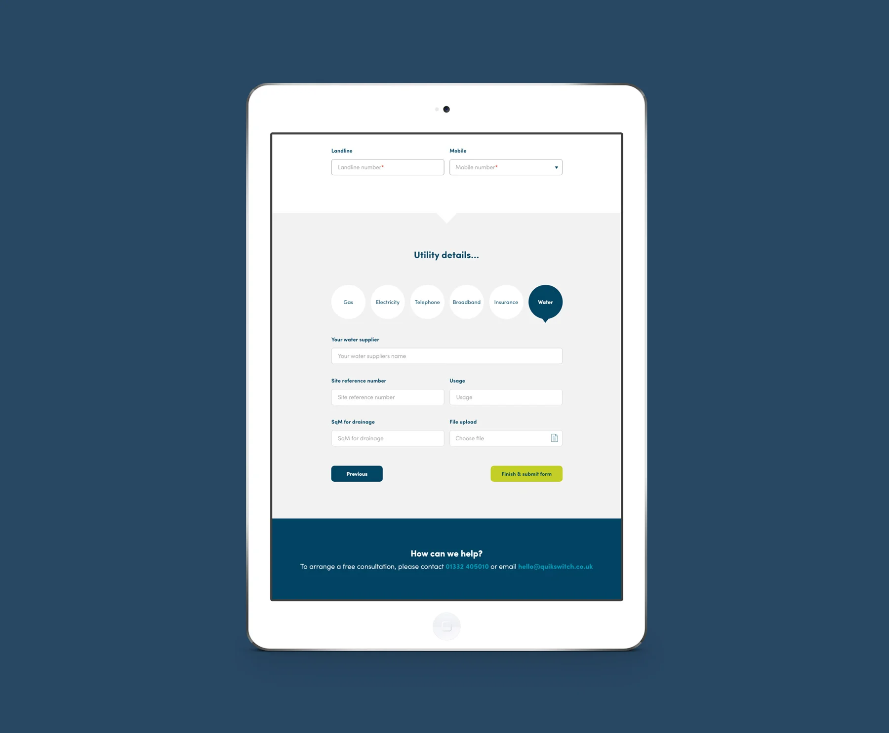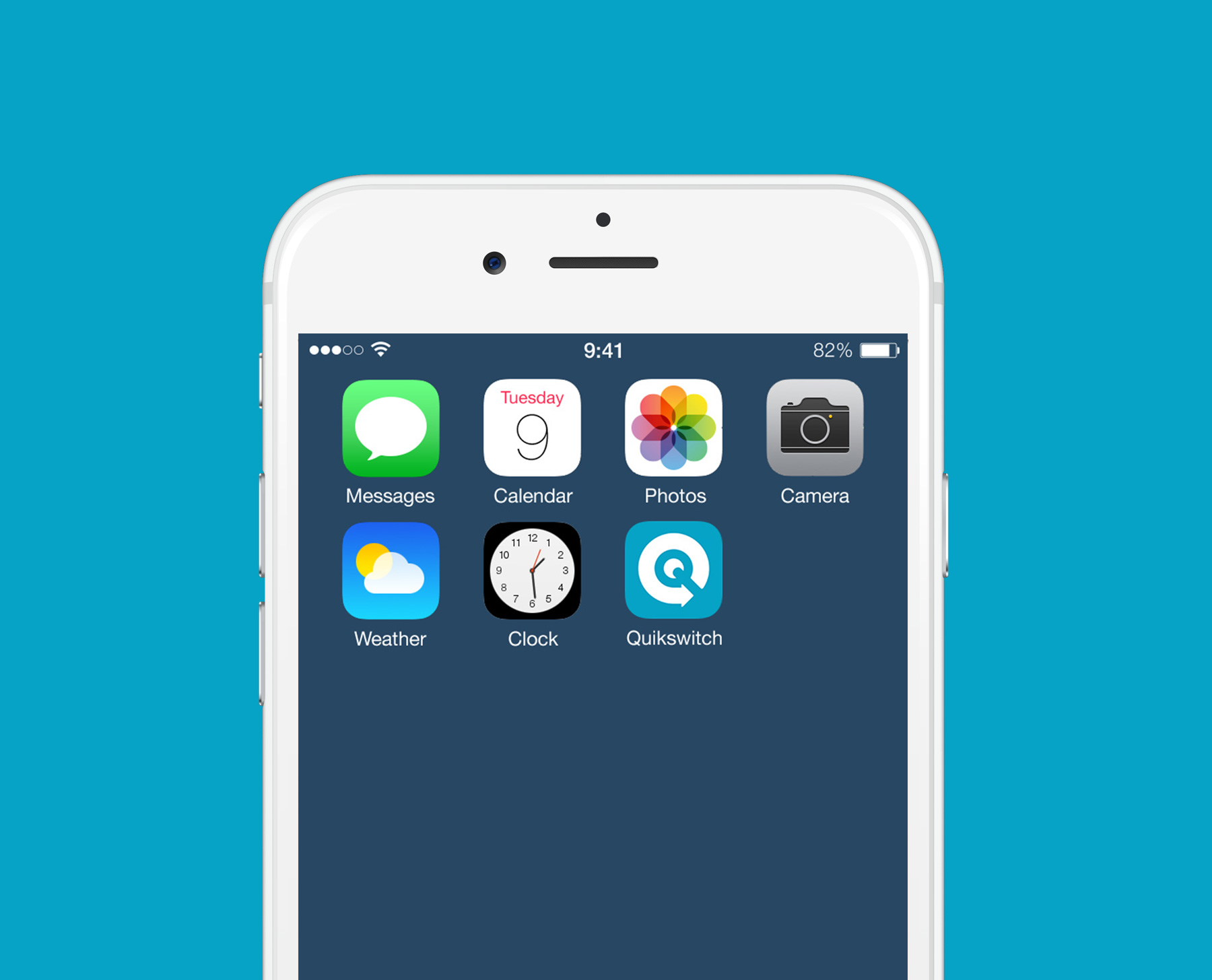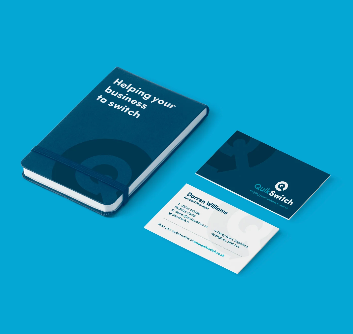
Quikswitch
Branding, Stationery, Print Design, Web Design
Quikswitch are a 'quick and easy' energy comparison service based in Nottingham, targeting business owners and helping them save as much as possible when switching energy providers.
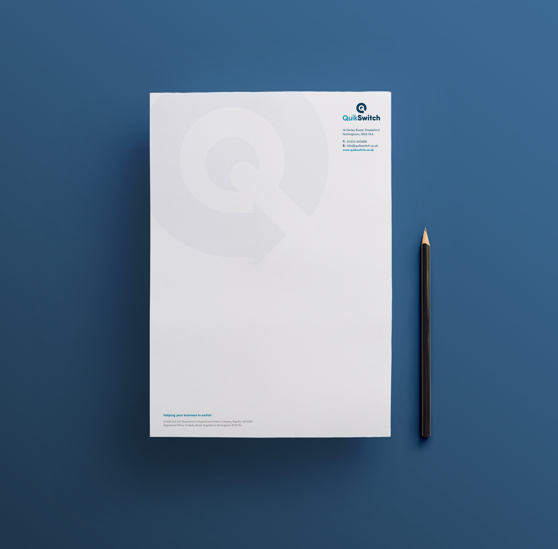
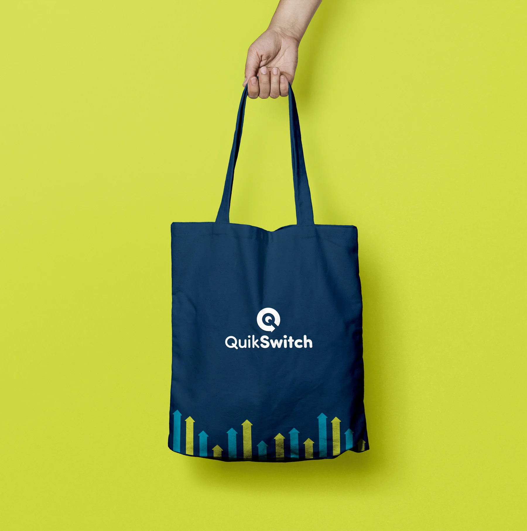
I was tasked with creating their Brand Identity from the ground up, starting from a logo device I came up with that revealed a letter 'Q' inside the negative space of an arrow - symbolising movement and the fast service Quikswitch offer.
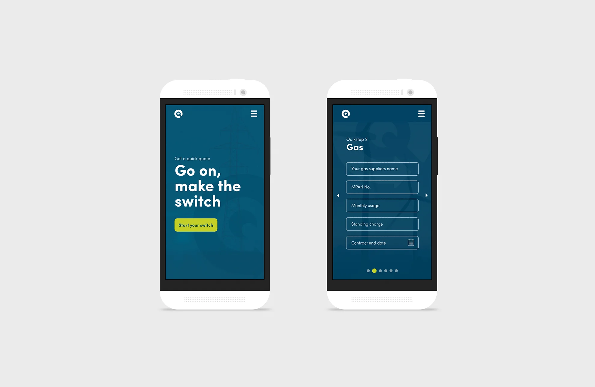
Later came the Web design, that was designed to take advantage of parrallex scrolling to show elements moving at different speeds.